Thoughtful
Launching an Innovative Content Vertical
Summary
Product
Thoughtful is an app that helps you combat loneliness and nurture your relationships by making it a habit to reach out to people daily.
Context
In generative research, our most popular proposed feature was "guidance content" to help users navigate difficult conversations, or build communication skills.
We knew the content had to be 1) trustworthy, 2) actionable and 3) easily consumable, but no direct precedent existed on the market. So, we had to imagine what this would look like from scratch.
Research Question
What would compelling and actionable content look and feel like in the Thoughtful app?
Outcome & Impact
We created a unique and scalable way of presenting proprietary content in Thoughtful, alongside detailed brand tone and voice guidelines.
As of November 2023, there are 450+ unique, expert-reviewed articles in the Thoughtful app library.
Initially guidance content was only paired with relevant reminders and prompts in the user's daily practice. However, the feature was so popular that users asked we create an Article Library to access content on demand, which was rolled out in September 2023.

Process

Team
1 Researcher (me)
1 Content Director
1 Designer
My role
Conducted all generative and desk research
Structured and led design testing and content testing
Synthesized insights to finalize designs and inform copy guidelines
Timeline
From generative research
to feature launch: 5 weeksFeature expansion was built
months later based on user
feedback
Process Highlights
Step 1
Generative Research Review
Our process started with a review of takeaways from our early generative research sprint.
We knew that guidance content was the feature that users were most excited about, because not knowing what to say for a hard date, or how to improve a relationship, was a key pain point for many.
From this early research sprint, we knew:
content would have to be informative without being too long
it would also have to be highly actionable
"I feel like a lot of people, myself included, struggle to know how to respond to tough situations. Sometimes I just end up saying nothing, because I don't know what to say or do." — User Tester
Step 2
Desk Research
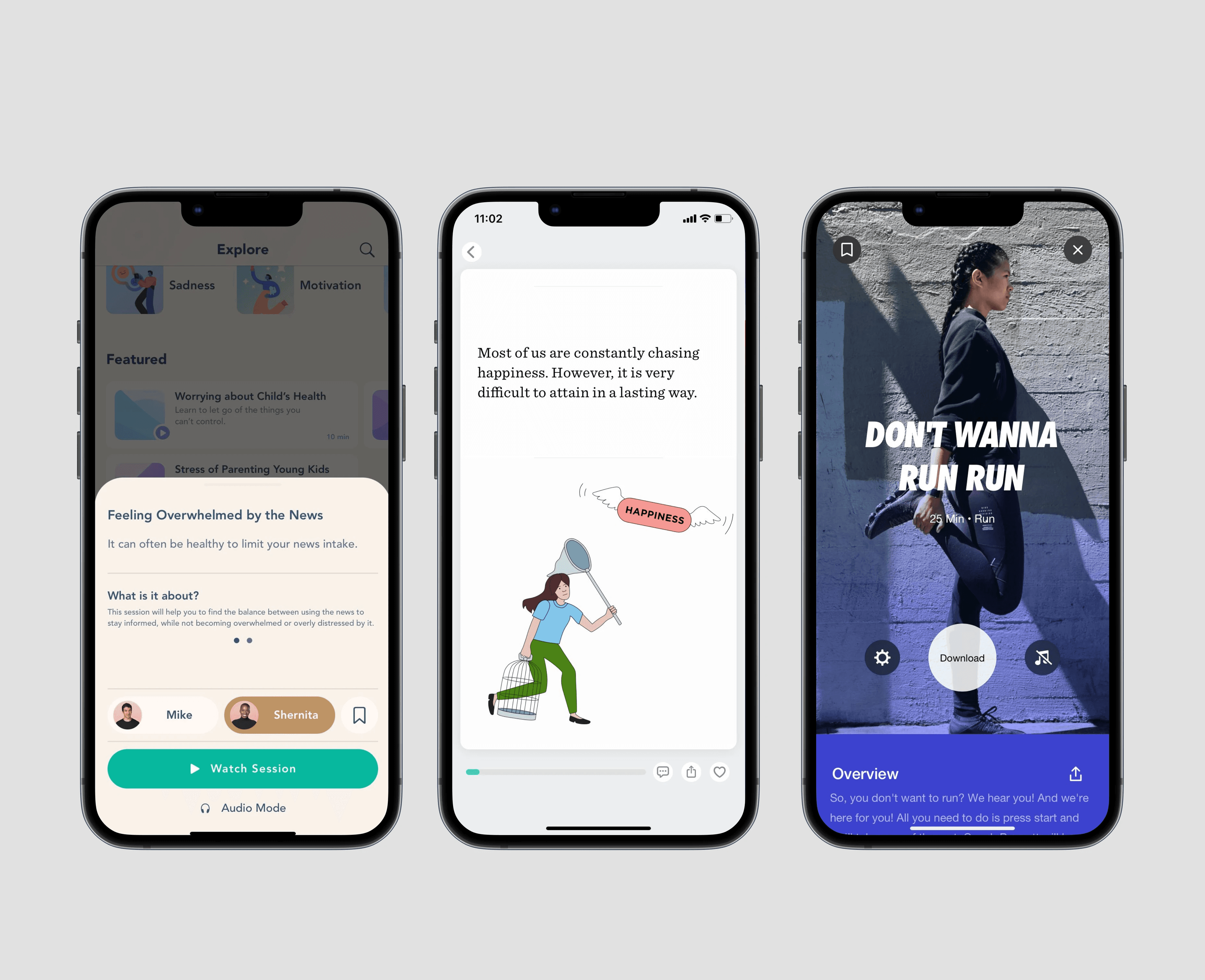
To help us build our unique vision for guidance content, I surveyed apps in our competitive space for design inspiration. We looked at digital products across: mental health & CBT apps, journalism & publishing, weight loss & fitness.
We ultimately folded a lot of inspiration into our own designs. Notable favorites included:
The swipe up audio trays in the Bloom CBT app
Snackable informative content from Lucid
Nike Run Club's bold audio forward designs, with swipe up text trays

Step 2
"A/B" Design Testing
We create three distinct design options, and tested them against users.
In live interviews, I discussed each design option with users and asked them to pick a favorite and name why.
(Designs were shown in a different order to each interviewee, to control for recency bias.)
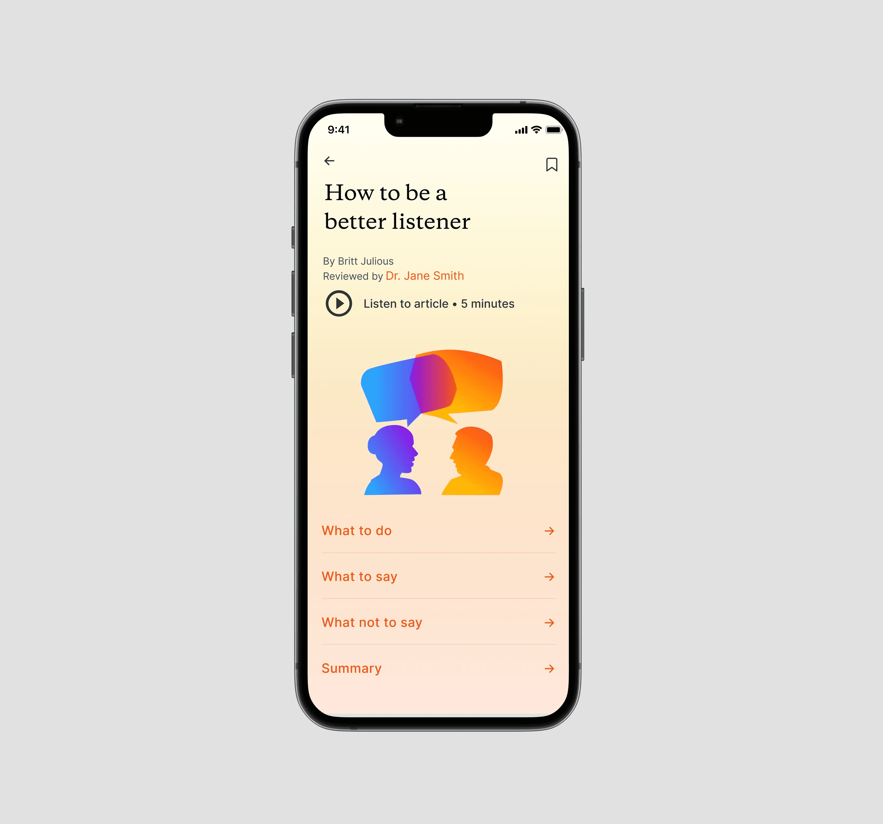
The universal favorite was the “Summary” direction. Users gravitated toward this option because they appreciated the ability to evaluate the article's subsections and choose what to read. It made them feel empowered and in control, rather than forced to consume content.

Step 3
Content Testing
Key positive insights
Key constructive insights
Step 5
Feature Expansion: Article Library
After making improvements based on user feedback, the Head of Design and Director of Content finalized designs and copy guidelines.
In subsequent months, we produced over 450 unique, expert reviewed articles for Thoughtful, on topics ranging from “How to Be a Better Listener” to “What to Say: Anniversary of a Loss.”
Initially, articles were paired with sensitive dates or prompts in the daily experience. However, they were so popular that users asked for an Article Library feature to access content on demand, which we built in summer 2023.

Other Projects
© Jacqueline Gufford, 2023


