Thoughtful
Creating Thoughtful's Connection Style Test
Summary
Product
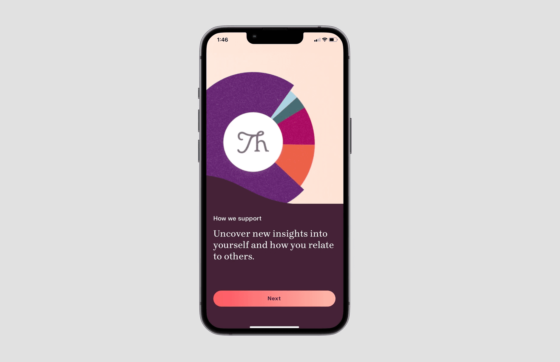
Thoughtful is an app that helps you combat loneliness and nurture your relationships by making it a habit to reach out to people daily.
Context
As we prepared to go to launch, we needed a tool to pique interest in our product and attract potential users.
Research Question
Could we leverage our existing user research to create a compelling personality test with the potential to drive interest in the app and downloads?
Outcome & Impact
We built the Connection Style Test because we observed strong user engagement in testing. Once live, it generated:
cost per install <$3 per user
~20% conversion to free trial subscription
The Connection Style test was so effective at recruiting users that there are plans to personalize the whole app experience around the user's connection style.

Process
Team
1 Researcher (me)
1 Product Manager
1 Designer
2 content writers
My role
Developed the personas that drove the personality test
Created prototypes of the personality test
Led all user testing & analysis
Timeline
From research to build: ~4 weeks
From build to launch: ~3 weeks
Iteration: continuous
Process Highlights
Step 2
Test Creation & Prototyping
Leveraging insights from desk research (including an audit of prior user research), I worked with design and content to create a high-fidelity prototype of our personality test. We called it the "Connection Style Test."
The initial version of the test contained 40 questions and produced one result, the user's "Connection Style." There were 5 possible styles.
Step 3
Prototype Testing
Key positive insights
Key constructive insights
Step 4
Prototype Refinement
We implemented a number of changes to our prototype based on user feedback and retested it.
Key changes implemented included:
revising designs to make progress to finish clearer
editing test questions to be concise and scenario-based
redesigning results view to be more detailed
Tester responses were so starkly positive after these changes were made, that we decided to advance it to build.

Step 5
Build, Launch & Iterate
Post-build, we assessed funnel analytics and optimized the experience. Ultimately our qualitative user testing results were confirmed by the quantitative metrics.
Shortly after launch, the test generated:
a cost per install <$3
~20% conversion to free trial subscription
Other Projects
© Jacqueline Gufford, 2023


